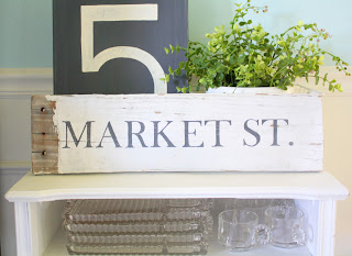
Hello Everyone! Today I wanted to share a few design tips from Nate Berkus, as well as my new Market street sign. I have more pieces of the old fence board that I have been itching to do something with, but I wasn't quite sure what. We were in Charlottesville, VA over Labor Day weekend, (more on that soon) and I loved driving around downtown as well as University of Virginia's campus. I love driving around old, historic areas because of the old architecture, and I love old street signs with names names like Elm, Sycamore, and Market. I decided to paint Market St. on my fence board because it has significance to my little lejardin Market etsy shop, and reminds me of Market streets in historic districts.
Last night I was reading Better Homes and Gardens Magazine, and came across some design tips from popular designers. Here are three of my favorites...
*You can never have too many woven baskets and bins
*Decorate with whatever makes you happy-whether its polka-dot pillows or ceramic bulls from Mexico.
*It's OK if the rug is a little worn. Your home should feel lived in and like a comfortable pair of boots.
~Nate Berkus
*Layer rugs! Use a larger jute or sisal rug as a base and layer smaller more decorative rugs such as patterned flat weaves or colorful vintage kilims. It will yield depth, dimension and endless texture.
~Sana Keefer
And, I might add...
Paint is the cheapest way to change the look and feel of a room. Also, if you have standard 8 foot ceilings, don't be afraid to hang artwork or pictures higher on the wall...it makes your ceilings look taller. Just don't put it by itself up there! Layer a vertical grouping of two or three pieces of art.


(1).jpg)


No comments:
Post a Comment