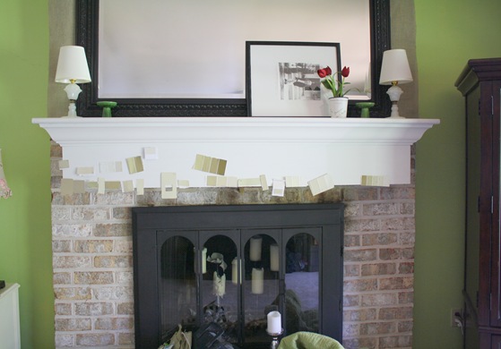
Actually, there was a “before the before”, but I didn’t get pictures of it. The mantle was a REALLY heavy concrete slab. We repurposed it as a bench for the fire pit! We are lucky we didn't throw out our backs transferring it to the back yard. Anyway, you can see it behind the garden in this post. My husband built a new, wooden mantle and I painted it my favorite "simply white" by Benjamin Moore. (Most of my house is painted in simply white~I think it is the perfect shade of white).
The fireplace had a BRASS screen that screamed 1980's. I (ahem) I, took it off myself, pulled it into the garage, and spray painted it black. I used a high heat spray paint from home depot that is made for outdoor grills. It has held up beautifully.
So that is the scoop on the "before the before". Here is a sneak peak of the after…
Remember this post where I showed you how to cover lamp shades with cute fabric? I put those two cute lamp shades on a couple of beautiful white, milk glass, vintage lamps that I picked up at a yard sale last summer for just a few dollars each. I thought they would not only look great on top of the mantle, but add much needed light to the space as well. I found the mirror on craigslist. It was gold and I painted it black.
So, I knew I didn't like the brick and wanted to paint it. After plastering the entire mantle with beige paint swatches, I finally decided on a color. I picked up a sample of it for around $5 at Sherwin Williams. I had tried to disguise the brick behind the mirror with burlap, so I decided to start first by painting the brick under the mantle.
First, I used a good primer. Then I painted it "Latte" to match my Ralph Lauren floral lamp shade on the desk next to the fireplace. I still had some paint left after I painted the lower half, but I wasn't sure that I liked it. So...I decided to pull down the burlap from behind the mirror and paint the upper brick simply white to decide which color I liked better. I ended up loving the look of it, and decided to leave the brick "two toned"!
I centered our first professional family photo that I showed you here, and then added a couple of green topiary balls in rustic, concrete, square pots. I am really into symmetry lately. I think it is pleasing to the eye and creates a sense of order. My favorite decorating colors still remain green, white, and black. It is so fresh, and classic looking to me. I love to use these colors all throughout my house.
Finally....here is the AFTER! (Again, it is the side of the house that doesn't photograph well with harsh northern lighting, but you get the idea.) What do you think?


(1).jpg)


It looks fabulous!! :o)
ReplyDelete