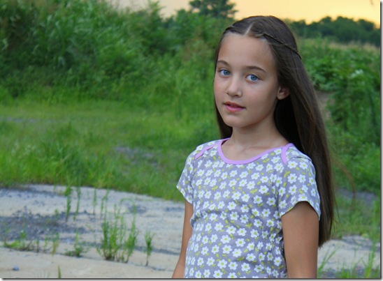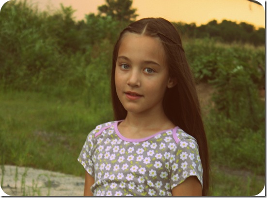
As we hunker down and await the arrival of hurricane Sandy, I'll share some of my favorite photos that I took of Grace and Ty this fall. Ryan was gone somewhere that day, (and he didn't have his braces of yet) so this reminds me that I need to take some pictures of him soon. Since you may remember that I don't like school pictures, I have to make sure to schedule time on my own to take photos of my kids. Unfortunately, I have forgotten from time to time, but I don't think in the long run my kids will be lacking in pictures!
I think I mentioned that I edit all my photos in plain old free Picasa. I have photoshop, but I don't really know how to use it, and I hate bugging Ryan all the time for help. So, I do what I can with free online editing programs. I prefer outdoor photographs because the lighting is so much better. However, I find that I usually have to lighten and warm up even the outdoor pictures.
This time, through trial and error, I learned a few fun things. When I cropped the above photo of Grace, I decided to have her be off center. In fact, if you draw an imaginary vertical line right down the center of the photograph, she basically takes up the left half of the photograph. If you think in terms of "shapes" when you edit your photographs, you might be pleasantly surprised with the results!
I must say, I think I am lucky to have such photogenic children...at least these two. Ty was definitely not thrilled to go on our picture taking adventure, but once we got there, he seemed to have a lot of fun. So, take your kids to a fun, dangerous location!!!! Wherever you go, be sure to get permission first.
Because Ty is blonde and has fairer skin (and because it was a little overcast outside), I had to darken and color saturate more of his photos than Grace's. I think I also used the "cross process" feature on this one.

Again, notice how she is mainly on the right side of the photograph if you were to cut the photo in half...

In this image, I clicked on the "1960's" icon to get a more vintage look. Why do I love it so much? Maybe because I have some similar pictures of me from back in the day to remind me of fond memories! When you click on it, you will get rounded corners and golden coloring.


In the photo below, the tire was yellow, and it didn't look good with his skin tone, so I changed it to black and white!

Notice the shapes in this one. It's almost like two vertical triangles, if you were to take a pen and draw a line from the top right hand corner of the picture to the bottom left hand corner of the picture. The subject is one triangle and the other triangle is the tire.


I like the texture and size of the tires in this one of Grace. Another thing to remember...if the subject is "gazing" give them room in the photo to continue their gaze. Does that make sense? In other words, it is better in this photo to leave more room on the left where her eyes are looking, than on the right side of the photo.

Here is another one that the colors didn't turn out so well on, so I turned it sepia.

This one was a little blurry, but I still liked how it was composed, so I kept it and played around with it...

Just for fun, I think I used "HDR-ish" or "Cinemascope" on this one...


Done!


(1).jpg)


Cutout Image Media is a well-known graphics design and image editing service provider in Bangladesh. We have 11 years of working experience in the image editing industry. We are specialized in Photography post-production services for E-commerce and Product Photography. Our highly skilled designers are committed to delivering you high-quality images. Client satisfaction is our main concern.
ReplyDelete