If you missed the "before" photos of my little kitchen, click here! First, I must tell you, that I decided against the transom idea. I love the look, but after taping a roll of paper towels against the ceiling to get an idea of how the transom would look, I decided that with the half wall separating the room, it seemed a little claustrophobic. It just wouldn't have looked right in that place. It would be better suited to an entry way, or a more pronounced room transition. I am glad for that decision because now we need a new garage door, a new car (s), a roof, and I would love to save for wood floors!
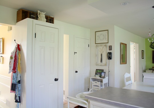
I love my "new" kitchen. I am so glad that we removed the hanging cabinet over the peninsula. Mom, I should have taken your advice well before now! It is so open, and I was able to rework the storage. I don't even feel like I have less space, because the kitchen is now more organized!
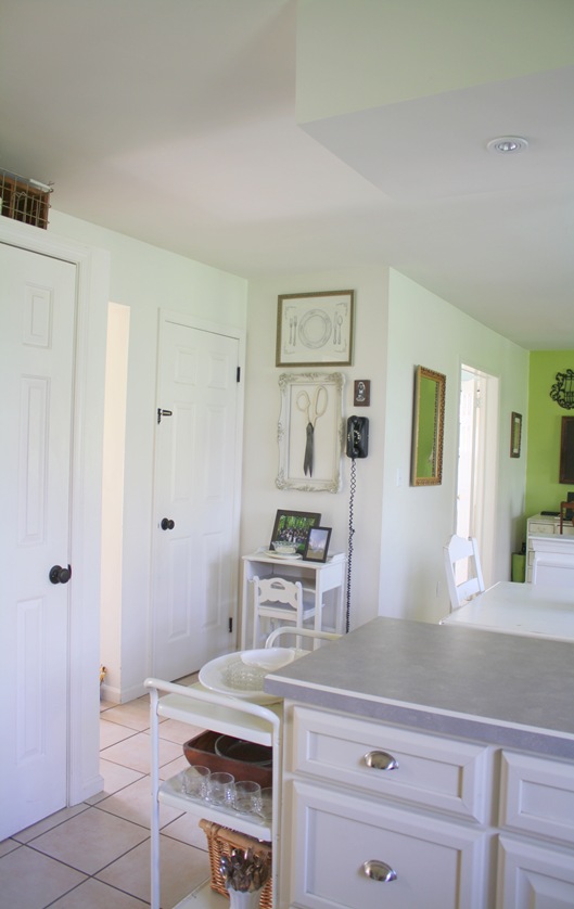
After reading Susan's Susanka's books, and taking out the cabinet, I actually decided to keep the soffits! They added that variation in ceiling height which Susan says is so important. My kitchen is still my cozy little corner, but it feels more spacious because I don't have the cabinet obstructing my view.
Our good friend helped us install a couple of little can lights (only about $15 each from Home Depot!) in the soffit where the cabinet used to be. Pendants would have obstructed the view.
And my other dear friend helped me build a shelf where the old cabinet met the wall! I love it because now I have a place to display some of my favorite kitchen things. Did you notice the glass canister on the counter that now holds my cupcake liners and sprinkles? That was an idea from pinterest. love pinterest.
Since it was such an inexpensive project overall, I splurged and bought all new door knobs for main level. I was so happy to see those brass babies go!
Remember the pitcher and bowl I picked up at a yard sale for $3? Well, the pitcher now rests on top of the pantry in a metal wire basket I picked up at an auction a while back. The wood thing I picked up at a yard sale years ago.
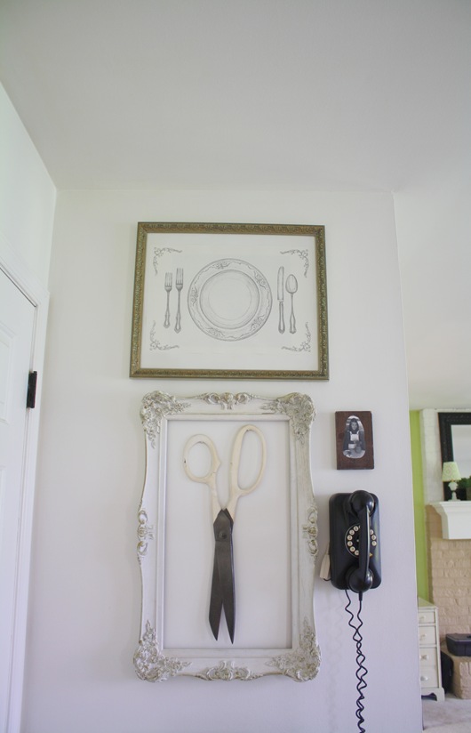
Now listen here! I have discovered something. PERSPECTIVE and VISUAL TRICKS. You don't have to hang everything (pictures) at eye level anymore! Decorating "rules" are meant to be broken. My sister in law gave me a paper place mat with a place setting printed on it. It was one of many in a tablet...maybe to teach kids how to set the table? Anyway, I framed it in a frame I had (took out the old art work) and hung it much higher than eye level in this little nook area. I discovered that my 8 foot ceilings now look much taller!
After we took out the cabinets and installed the can lights, and patched the walls and ceiling, I painted the ENTIRE ceiling a flat white. If you look at the before photos, it was cream. Since there is no divide between the kitchen and family room, I had to paint the ceiling in the family room also! Two coats-it was a big job.
Here is a close up of the shelf. I do have some patching and painting to do on the cabinets next to it, but that is minor. I know I have too much crammed in there, but I can't decide which of my treasures to display! The cake stand was from my sister in law for Christmas from Costco! I love it. The juice glasses are from a favorite restaurant in France. (we didn't steal them, we bought them!) The vintage timer is from a church rummage sale. The black glasses are from thrift store, and the milk glasses were from the Christmas gift our family loved!
Oh yes, remember my big chalkboard on the other side of the cabinet? It had to find a new home. I will show you where I put it in another post!


(1).jpg)


I LOVE IT!!!!
ReplyDeleteThe cabinet looks perfect in there!!
I'm so glad it all worked out!
So open, love the can lights, new hardware and fridge look! Definately hats off, Mrs. B
ReplyDeleteSOOOOO gorgeous!!!! I love how it turned out. SO bright and airy!
ReplyDeleteWell I think it turned out just so cute! Very fresh and springish. Love that green paint in the family room. Mimi
ReplyDeleteI can see why you love it so much! It's now a light filled, cozy space. You've done a wonderful job. Gorgeous.
ReplyDelete"SOOOOO gorgeous!!!! I love how it turned out. SO bright and airy!" I agree, having a white theme home is really neat, clean and nice to eyes. I love those white kitchen worktops
ReplyDeleteAlot of work I know but so worth it! We are putting canned lights in our kitchen too, yours look just wonderful!
ReplyDeleteI noticed the beautiful green cake stand, is it an heirloom or a flea markert find. Can't believe summer is almost here. Hope all is well. Nora
ReplyDeleteHi Nora,
ReplyDeleteThe cake stand came from Costco!!!
It turned out amazing Robin! Good vision! We are so alike! I bought the exact same cake stands at Costco. I did end up tradeing my greens one out for the white set but loved the green ones too. I even bought my sister a set!
ReplyDeleteRobyn, your kitchen is beautiful. I love the brightness and the soft colors. Looks like you put in a lot of hard work and it paid off. :)
ReplyDelete